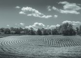
The challenge, he said, actually comes from painting nature, which many artists think is easiest. But many landscape photos have to be culled before an original composition can emerge.
“You will throw away a third of the photos you’ve collected and there will be a lot of editing,” he said. Weidenheimer added that he prefers still life because the control it offers artists in manipulating the composition, colors and lighting of the subject. “Nothing is left to chance in content or composition.”
The problem with reference photos, he said, is a bad photo that is visually distorted in some way and lacks enough clean visual elements to paint from.
“Some require so much tinkering with lighting, colors, shapes and composition it would not be worth the effort,” Weidenheimer said. He cited a few possible problems with photos, including the eye being drawn easily through the elements of the scene and distracted from the center of interest.
Another issue is when the scene lacks coherence; there is no harmony between the shapes and lighting.
“Artists call this the Hamburger Problem,” he said. He added that images marred by the camera can cause distortions of lighting, contrast and perspective. This includes value range distortion, not being able to distinguish the lights and darks, burned out light areas and blocked detail in dark areas.
There is always the “fun house” effect with perspective distortion, converging vertical lines, wide angle distortion and color distortion from fluorescent lighting. This is often seen when the photographer is too close to the subject.
“Don’t shoot with a flash,” he cautioned. “You get a white-out effect and lose detail in the shadows. It looks as if they’re in a holocaust.” He said to override this problem, put your subject in the shade and get intense colors out of the sunlight or take photos on an overcast day with no sun.
To avoid the issues with distortion and lighting, Weidenheimer suggested standing back when photographing people and steering clear of the close-up shots. The same is true for architecture: If the photographer is too close, the building will look tilted or distorted. While photo editing on computers can allow for straightening of buildings that look off-balanced, he encouraged his listeners to shoot buildings from a distance.
Weidenheimer mentioned pointing the camera in different areas of lighting so it can read those areas of differing light. It used to be that photographers used a meter for this back in the day but now cameras can do the work. FAA member Susan Lang also added a good tip; she said she taps her phone screen for the areas in which she wants it to read the lighting.
Edit photos on the computer and try to find several elements in the photos for compositions and crop them. This is the beginning of planning a painting by using reference photos. He stressed that landscapes require more structure: Look for flowing or angular shapes, dominant values, mostly warm or cool colors and put the pieces together to create a whole.
“You can also create a composition from other photos and sources,” Weidenheimer said. He could not emphasize enough how important the sources artists use for creating paintings are the first step to success.


