By Page H. Gifford
Correspondent
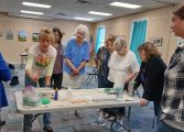
Artist and educator Leah Olivier met with members of the Fluvanna Art Association on Aug. 15 to discuss how to achieve harmony in painting.
The dilemma for many artists is how to use fewer colors and keep the cost of supplies down while creating art. Olivier referenced the paintings of artists who used only three colors to create their pieces.
By using three primary colors plus white and black, Olivier demonstrated how to make a color wheel divided by cool and warm colors.
“To create color harmony in your paintings, use fewer paints and do not use intense chroma colors directly out of the tube – it directs the eye directly to one spot,” she said. “If you want the eye to flow then use more chroma in the foreground and less as they recede into the background.” She said the key is simplicity, limiting colors help the artists to move through a painting quicker. “The best way to know a color and its relationship to other colors is to use it in a limited palette.”
She then discussed the use of black.
“Black is the absence of color and light,” she said. Using black can be tricky, not easy to control, and less forgiving. She used the work of Claude Monet and John Singer Sargent to illustrate their use of black in their paintings. “They practiced with it and knew how to control it.”
Two other paintings used to illustrate her point about the masters’ use of black was the comparison between Franz Kline and Claude Monet. Analyzing the black and white and the color paintings, the black and white were dull and less vibrant.
Another consideration when creating paintings is using photo reference which also influences the colors artists choose to use.
“Stop being a slave to reference photos,” she said. She pointed out that photos are not foolproof when it comes to referencing them since they may contain oddities or suspect lighting issues and should not be copied into paintings. “If you have a bad photo, your art will be bad. Be careful of photos, the camera flattens images. It is better to work from life. Use a sketchbook to capture elements of lighting and color.”
She tied color and photo reference together.
“Photo reference can help you to understand your subject, make a reproduction for value analysis, look for dominant and sub-dominant colors, and to edit out unnecessary parts of the photo.” She added that she uses components of various photos to create one painting.
“A limited palette means freedom, use what you have and make it work.”


